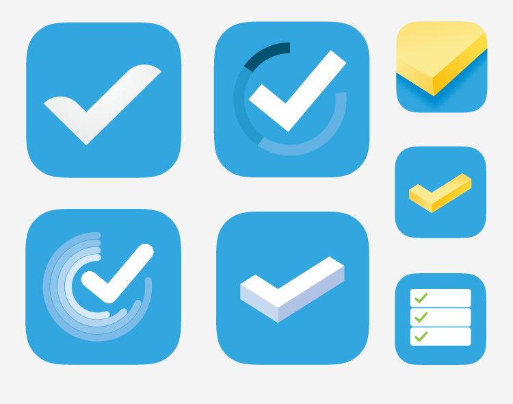
Familiar, Yet Different
Initial design explorations around keeping the checkmark as the main symbol of the app icon. The argument was to keep it familiar, yet different enough that it made the app icon look fresh and new.
Here are several designs that peaked some interest through this phase of the brainstorming process.
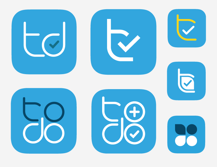
Completely start over
In these design explorations the goal was to find a completely new way to represent the app. The checkmark still played a role but only as a supporting element.
The designs show the concept of utilizing a logotype identity to create the app icon. Multiple iterations were completed some of which were my personal favorites.
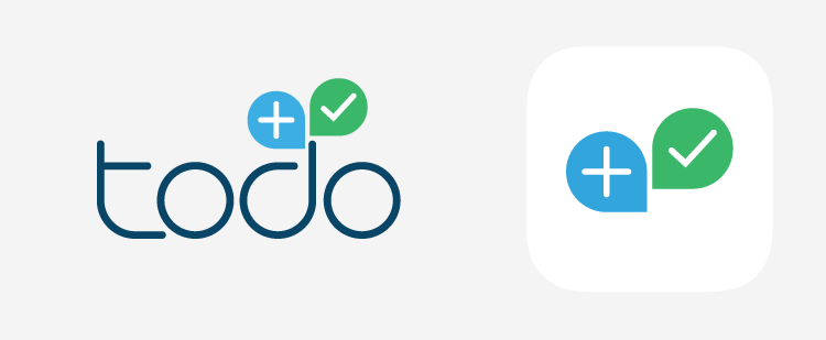
Alternatively I created a full redesign concept for the identity with matching icon.