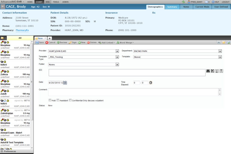
Breaking Down the Original UI
Medical applications are notorious for their horrible UI and complicated UX views. I set out to design a mock UI with the assumption that the architecture requirements would remain the same. I first started by breaking down the interface into sections and starting tackling each section at a time.
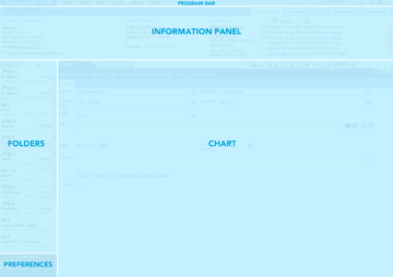
Program bar
Designed to be a global navigation element across multiple applications.

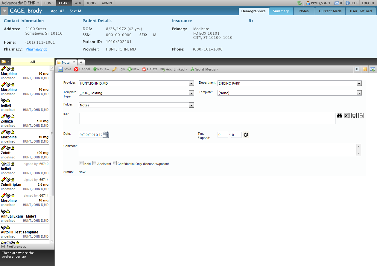
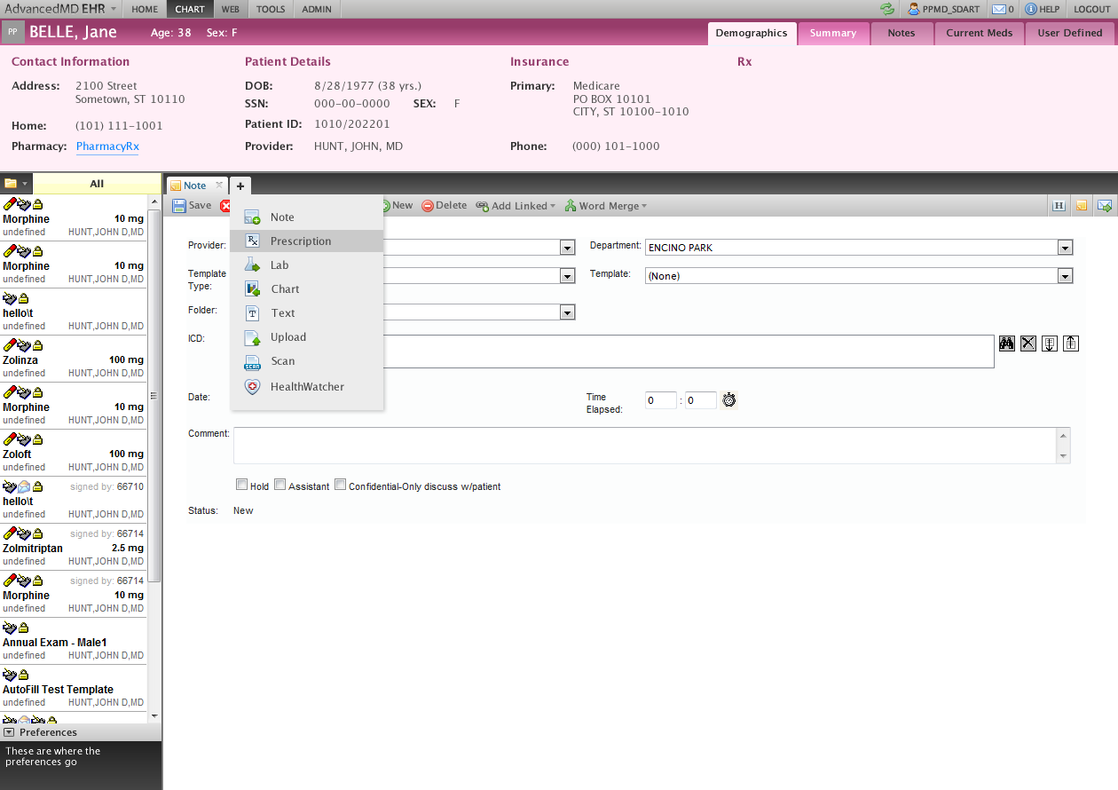
Patient information panel
This section of the UI is dedicated to showing the patient information. I cleaned up the readability issues, included a hover-able patient photo and brought in the use of color as a visual aide for patient gender.
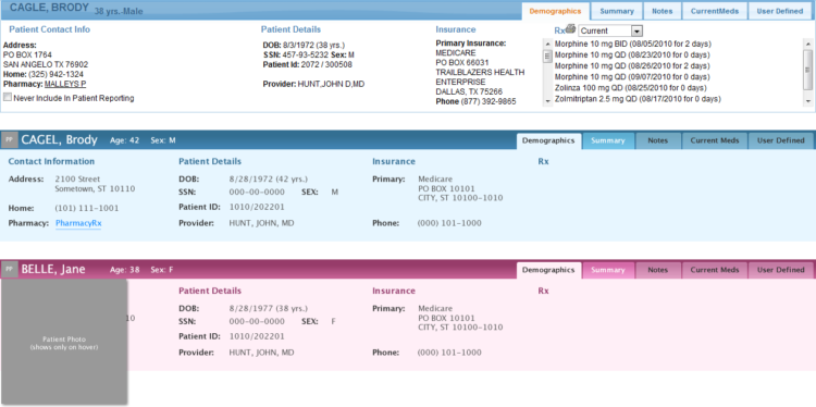
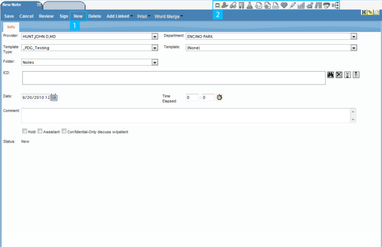
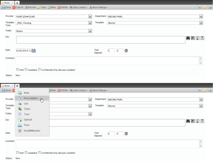
Chart pane
The original chart pane has a confusing UX pattern for adding new chart items. Clicks labelled 1 & 2 are disjointed and don't really seem related. In the redesign beyond improving the visual look of the tabs and the chart bar, I redesigned the UX pattern of adding new chart items into a cohesive workflow. A user hovers over the plus button in the tab bar, they are presented with tab types, once a selection is made a new tab is created.