Logo & branding refresh
One of the first things I did for RainFocus was to refresh and clean up their identity. At this phase I suggest multiple brand palettes and an optional logo redesign. After selecting to keep their original logo design I cleaned up the scale and logo type to better represent their business objectives. Because their main business objective is to provide better focus to event analytics, I suggested we bold Focus rather than Rain.
UX & Visual Design
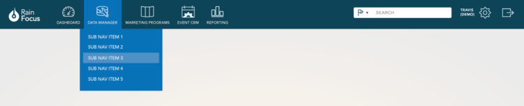
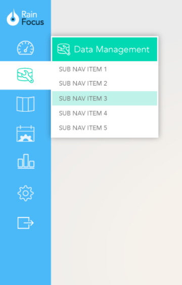
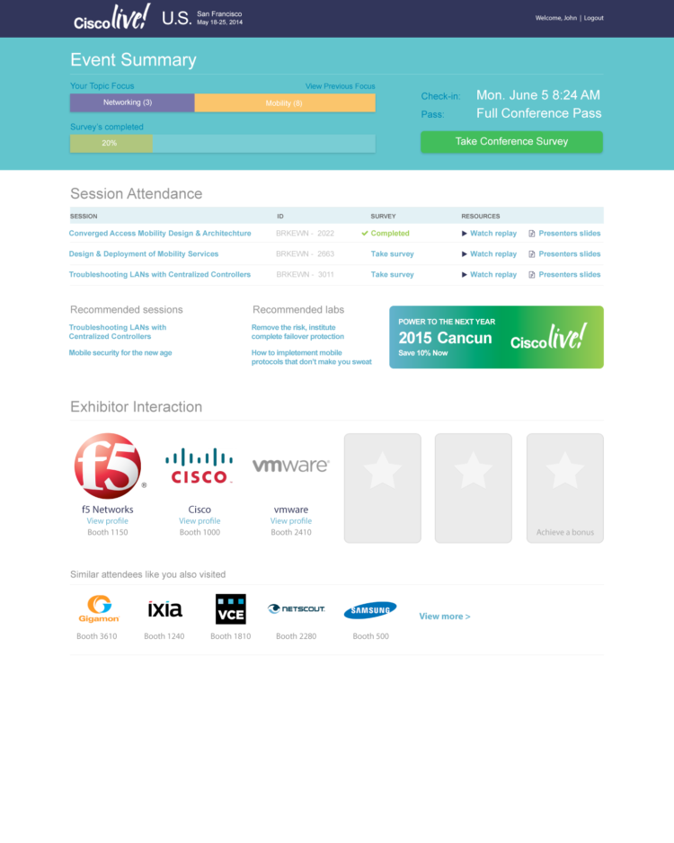
As part of the project, I was asked to design the administrative interface navigation. I provided both a horizontal and vertical navigation option with variations on the brand guidelines. Also, as part of the project was asked to design an attendee-facing dashboard page.
Site Theming Options
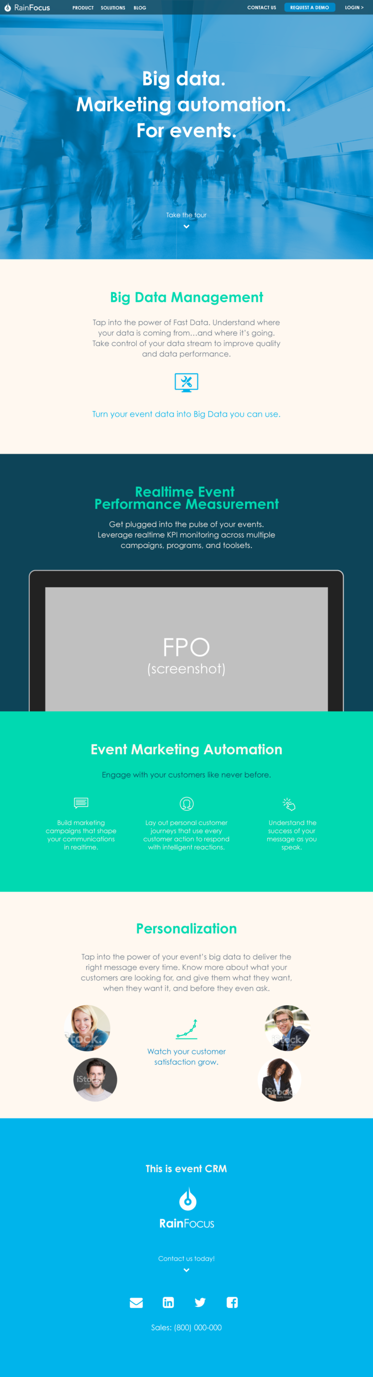
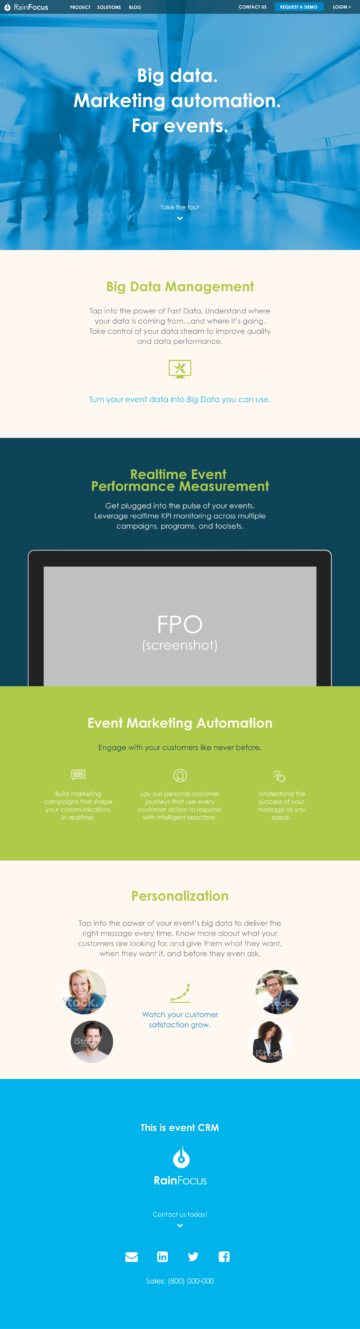
The new color palette expanded the options to make the site unique and vibrant, thus improving the potential visual interest throughout the site for visitors.
Presentation Design